Material Optimization in UE4 / UE5
Contents
Materials Overview
Materials vs Material Instances
Shader (Material) Complexity
Textures
Transparency
LODS
Materials Overview
Materials define how objects in your game look. Everything in your game is made up of 3D points (some of which are exclusively in a 2D plane), and materials tell these objects how to look. Optimizing materials can be extremely beneficial, but also can feel like a compromise, as these define the look of your game. We will try to optimize materials to the best ability that we can, while preserving the look of your game.
Materials Vs Material Instances
I’m sure if you’re looking to optimize materials, you already know the main differences between materials and material instances. As Epic will tell you, the primary distinction between these is to help with your pipeline. Having few, recognizable parent materials, that expose parameters to many instances, can help reduce your shader compile times, allow you to change parameters and see results instantly, and keep your mental designations of which materials are for which kinds of objects very clear.
They don’t seem to talk as much about the performance implications here, they are more minimal to be fair, but still a worthwhile endeavor (in my opinion). Every Material you have, will have it’s own separate shader code. This means each one has to compile separately into instructions, and they will have to package and ship with your game, making the download size larger, as well as have to be loaded into memory, meaning more runtime memory usage. As well as the fact that two materials that look the same, but are compiled differently, won’t be able to batch together, and when drawing both of these shapes, the processor or GPU will need to look at different memory to determine the instructions to use for displaying the object to the screen. The impact here can be minimal, or could be more substantial depending on your situation. Epic likes to claim that this will not have a performance impact (0.5 ms) but I think .5ms could be substantial to some, and depending on your project setup, the benefits could be more impactful.
Shader (Material) Complexity
There are two ways to determine the complexity of your material/shader (I use both interchangeably). When working on a material, along the top of the screen lists a stats button along the toolbar. When selected, a “Stats” window will appear on-screen telling you the instruction count. This is one way to determine complexity, and is generally good, although it’s worth noting that some single instructions are much more costly than others. Along with this, there is also a ‘Platform Stats” button and window that will show you instruction counts per platform, per quality settings (epic, high, medium, low). This can give you a better idea of how it will run on your target platform, at target quality settings. Note that to get exact counts on some platforms, Android for instance, you will need an offline compiler installed and linked in your editor preferences, I will not cover this here.
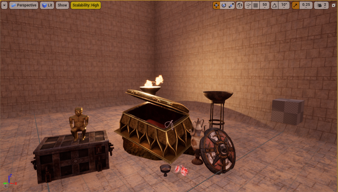
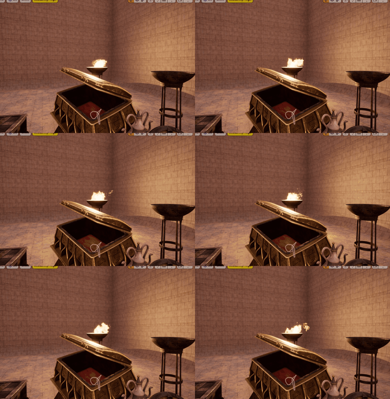
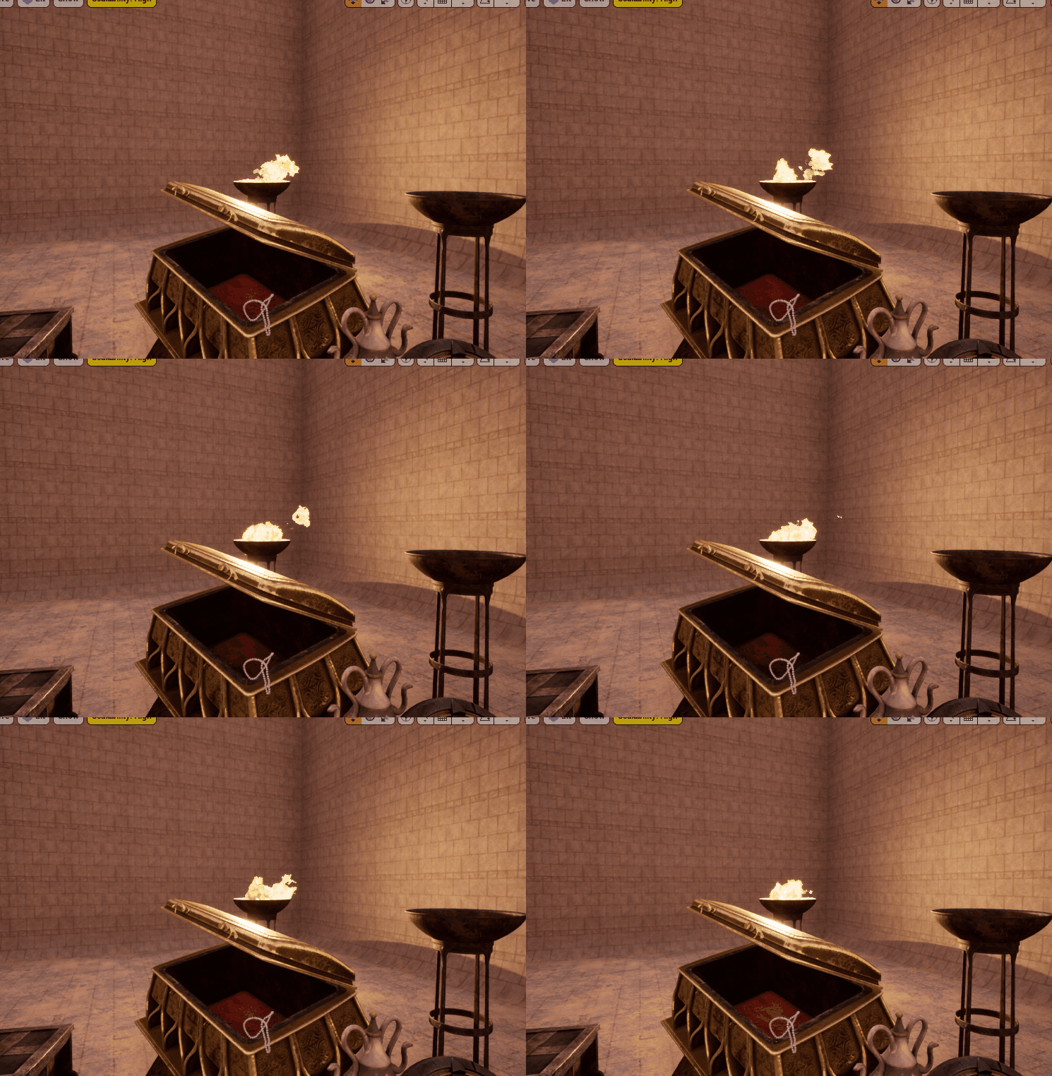
To figure out which materials even need to be looked at is a different story, and one generally good way to do it is using the “Shader Complexity” view in the viewport. This will color everything in your scene not by how it actually looks, but as a heatmap from simple to complex shaders. This is a good tool to just get a quick look at your scene to see which objects have complex shading. If you look at the following scene, with assets from (INSERT ASSET PACK HERE). Notice all the objects, and what you think will have large instruction counts.
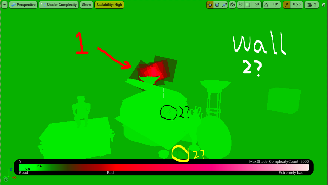
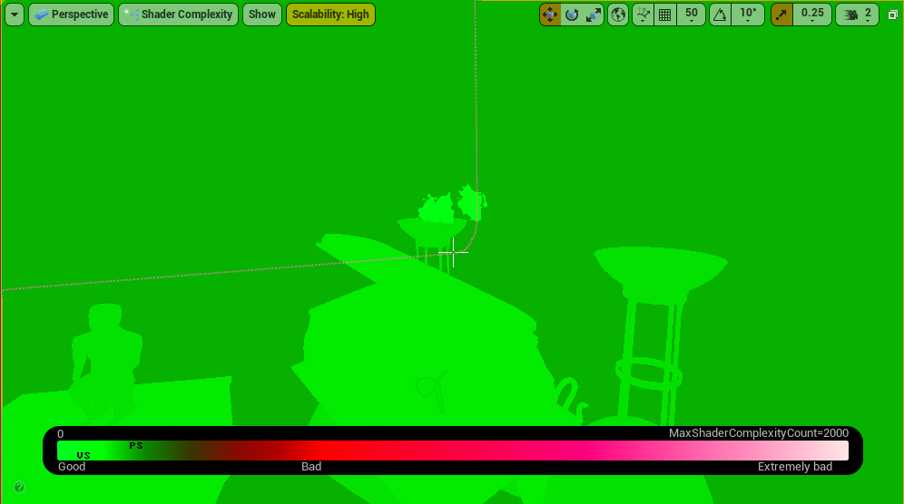
Now take a look at this scene with the Shader Complexity mode turned on. I have made some denotations on the image to mark which areas are particularly of interest:
The “1” marked area is clearly the worst, and this is the fire particles in the torch. Second most is a little unclear, is it the pearls on the chest? The wall? The gems? You will have to take a closer look, but this gives you a nice rough visual of what you should be looking at. Looking closer at the gems for instance we see the slider at the bottom shift left (less complex) as we look at the gems, and shift to the right (more complex) when looking at the floor/walls.
You can probably see that the floor is darker, but this slider gives a more concrete view of the difference.
Given this information, we might think that we should first look at the torch, and second the wall.
The Torch:
The first thing you’ll notice with the torch, is that the problematic “shader” is not actually one object/material that’s problematic. The main issue is that this is a particle effect with many quads using this transparent material. As they overlap over and over again, it becomes more and more complex, thus, the more particle emissions we have overlapping, the more complex. Thus there are multiple ways to go about fixing this, we could make the material that’s being emitted less complex, we could change the particle system to emit fewer particles, or in a different shape that creates less overlap, we could keep this detail, but only up close and swap to a higher LOD once farther away. I’ll go over these each a little bit, and use a mix, but I won’t go too in detail about LODs, as I have an entire article about LODS in Unreal Engine here.
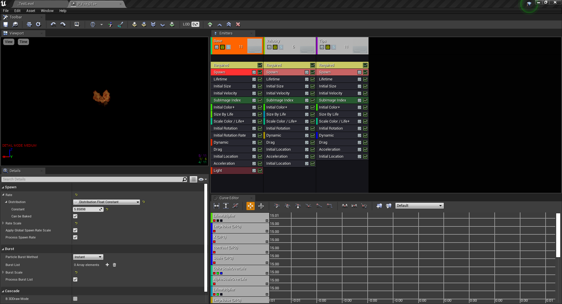
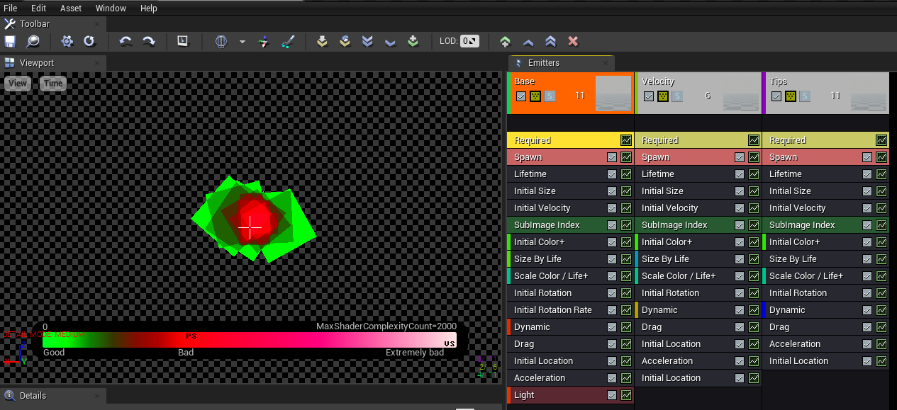
Once you open up the torch, you can see that there are three subsystems, Base, Velocity, and Tips.
Turning the “solo” mode on each of them, we can see more easily what each piece is doing. Mostly, they are all the same, but just with different screen alignment, directions, and time intervals to give a variable look to the fire. You may also notice at the top, it says we are using LOD 0. If you click “select higher LOD” you will notice there are none, this means that the fire will look the same no matter the distance to the flame. This is not typically the best way to utilize resources. In this view, we can use the same shader complexity mode to view the particle’s complexity.
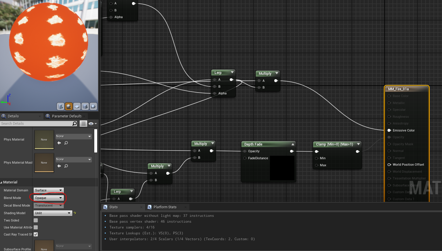
As an immediate first improvement, we can look at the material being referenced, as any change to this material will effect the flame in it’s entirety. Now, you would not really want to do this, but if we change the blend mode on the shader from “additive” to opaque, this will get rid of all transparency, and we can easily see how that effects the particle, even though this will give a very bad, undesired visual. In this view you can also see the Stats window change from 162 vertex shader instructions down to only 46 instructions.
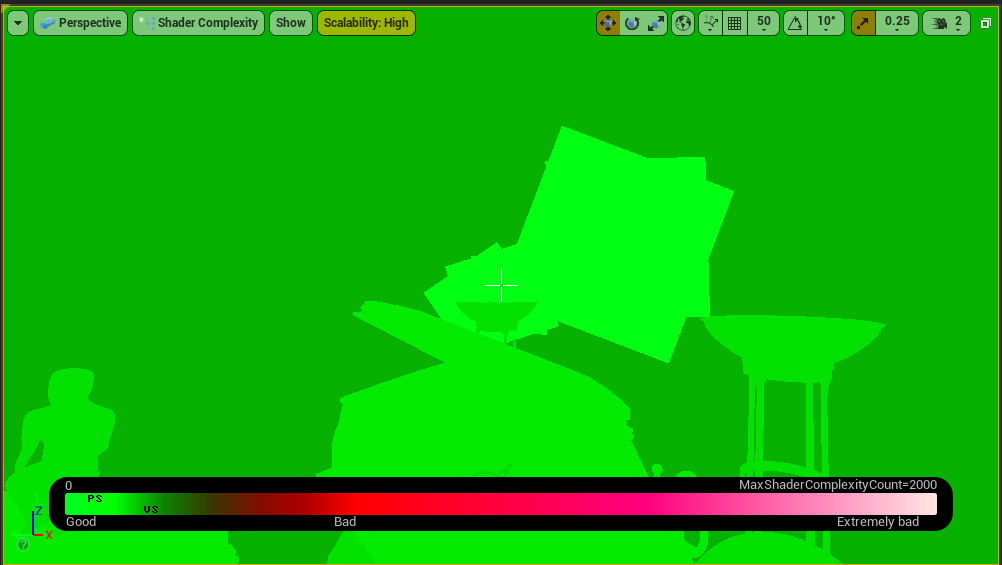
Now, looking at the scene view, we can clearly see how much the transparency is effecting this. When opaque, this is one of the simplest shaders in our scene.
Unfortunately it looks like this though…
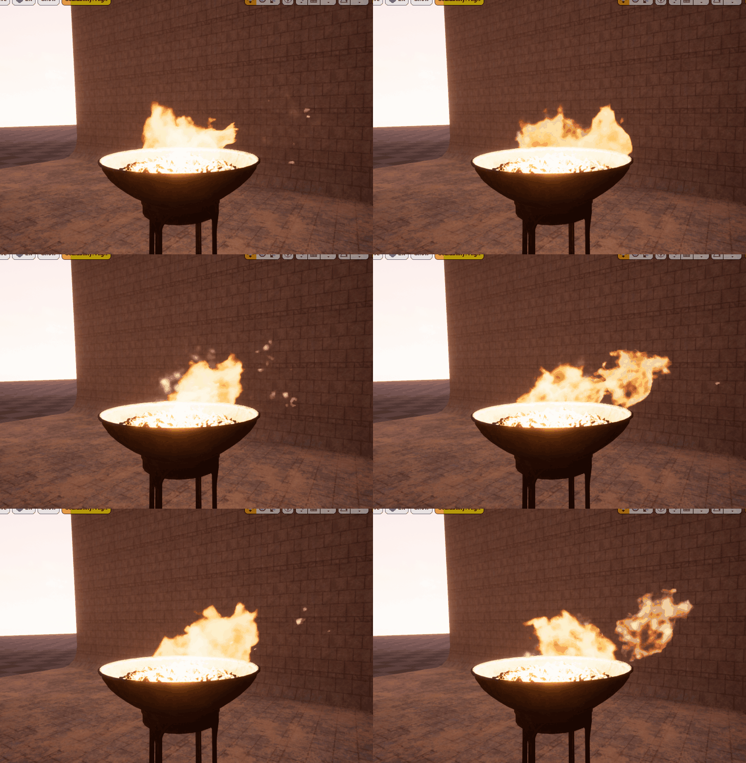
Compared to the original desired look…
But, we can at least think about and see how this material is effecting the shading complexity, we go from
162 instructions down to just 46. This is a big savings, especially when they layer on top of one another. This may not be viable, but maybe another is, such as the “Masked” mode, this isn’t “translucent” as much as it is either fully opaque or fully transparent, it won’t do the trick for nice looking fire up close, but depending on your scene (or your LOD) we might be able to swap to this for some good savings! The main change we have to make, is that masked, can’t read the scene depth (to get transparent information). If we remove this, and plug into the opacity mask instead of opacity, we get this.
Clearly not as wispy and beautiful, but also much cheaper, this cuts from the 162 instructions down to only 51! Just 5 more instructions than the fully opaque edition. This is how we look in the shader complexity view.
Looks like some great progress, and doesn’t even really look bad (in my opinion) but you can’t really argue that the up-close version is much choppier.
Versus the original
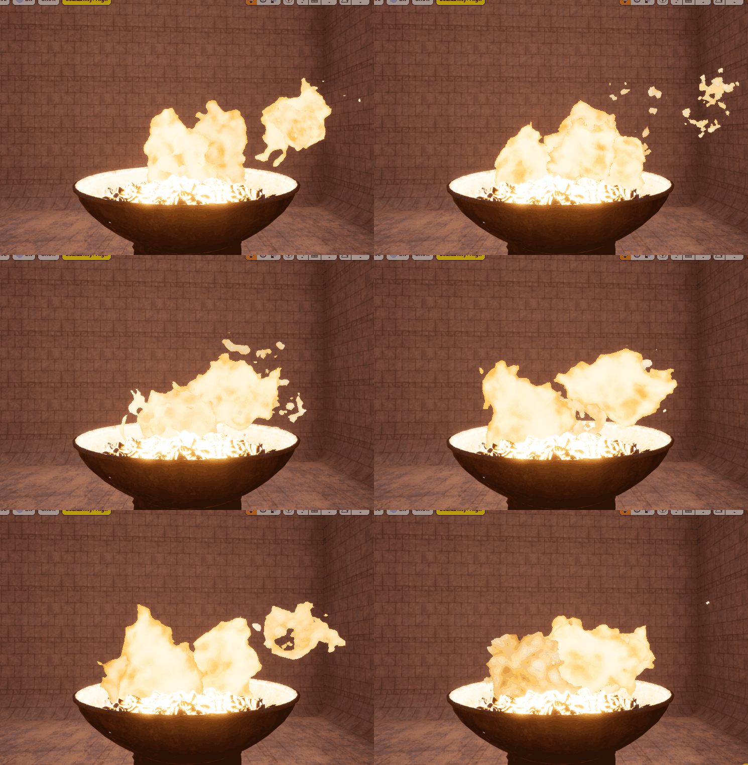
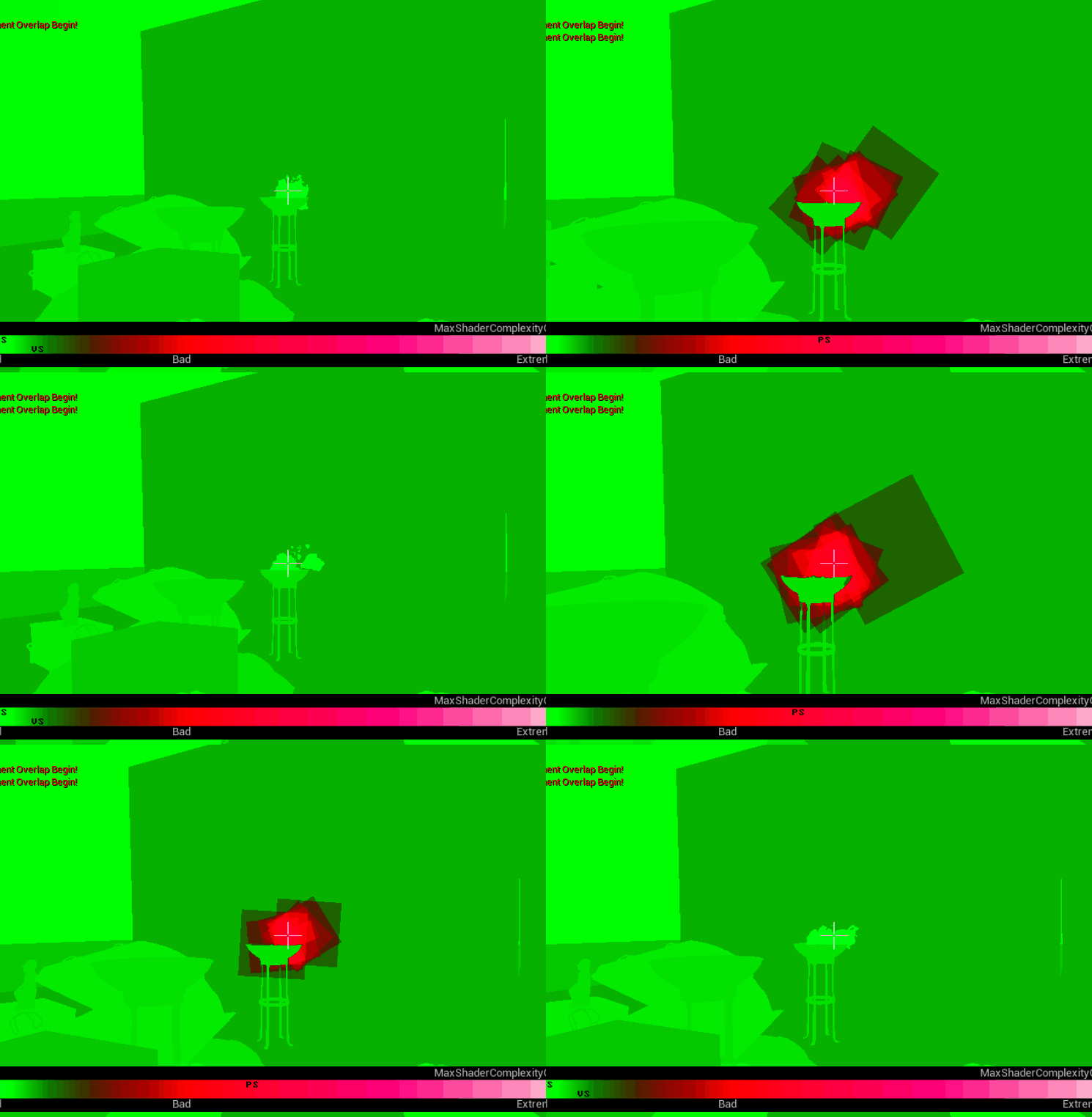
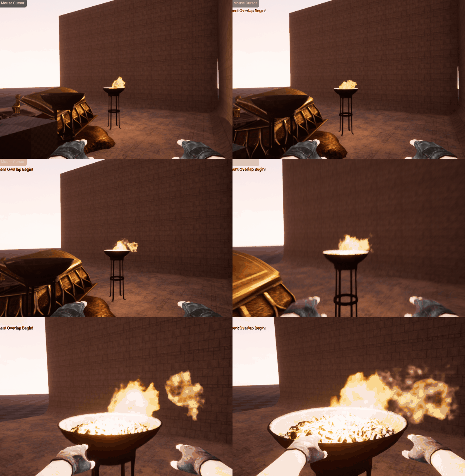
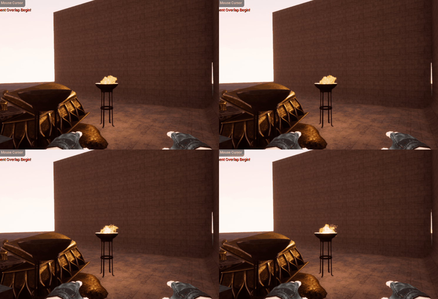
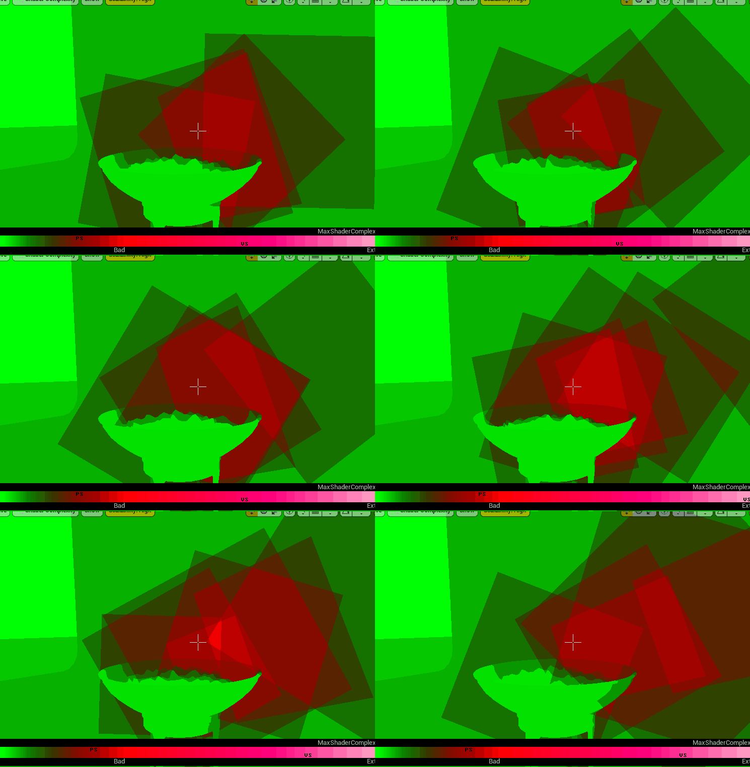
This is where LODs come in, we can use both of these, swapping to the lower cost material at a moderate distance, and using the high-quality material only in up-close situations. I’ll save my cheap version as a new material, add a new particle LOD level, and have it set to swap at some distance, let’s say 500 units for now. One thing to note is that particle LODs will ONLY swap when playing the game, not in editor, so if you’d like to test out your LODS, you have to play the game. Here is that it looks like in-game with an LOD swap. You can use the ‘F5’ key on your keyboard when in-game to swap to the material complexity view mode. And use ‘F3’ to swap back. The other F1-5 keys are other modes you should check out as well.
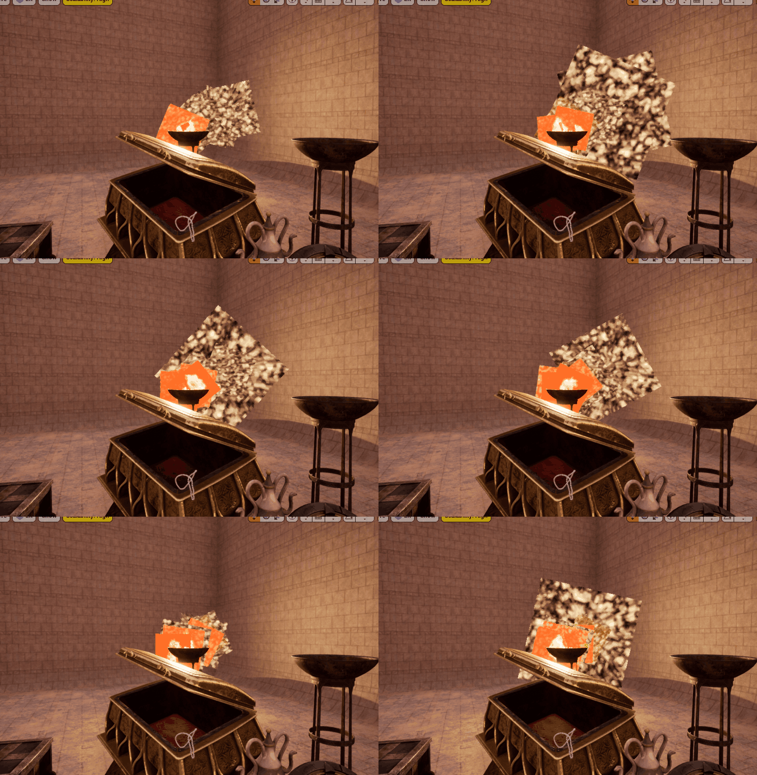
This looks quite crazy, and seems like it would look aweful in-game, but here’s the results.
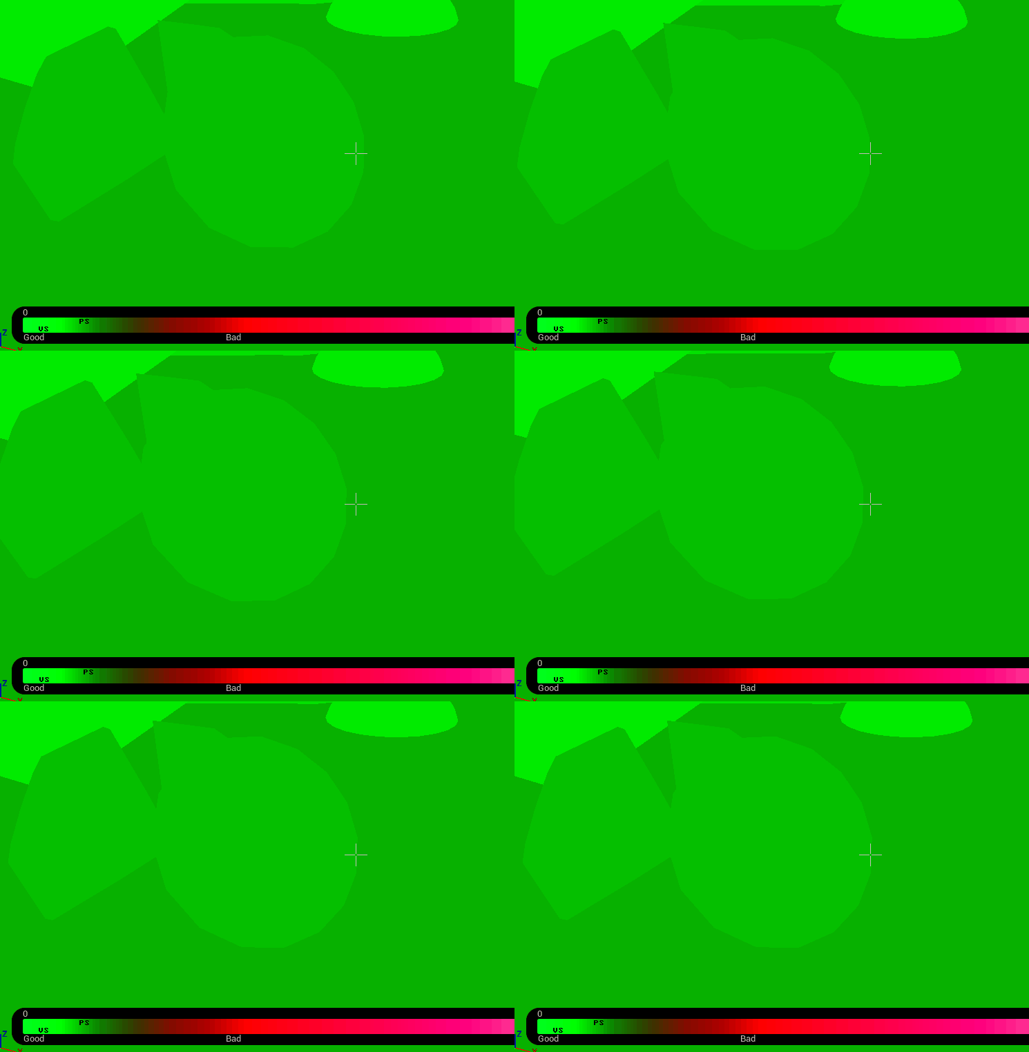
Transition Frames:
The transition here is subtle, in my mind, but if you find yourself noticing this swap, or feel you can notice the poor fire quality at this distance, all you need to do is push the 5 meter LOD distance up to something higher, say 10, 15, 20 meters? You’ll still be thanking yourself when you have the character walk through a torch-lit castle.
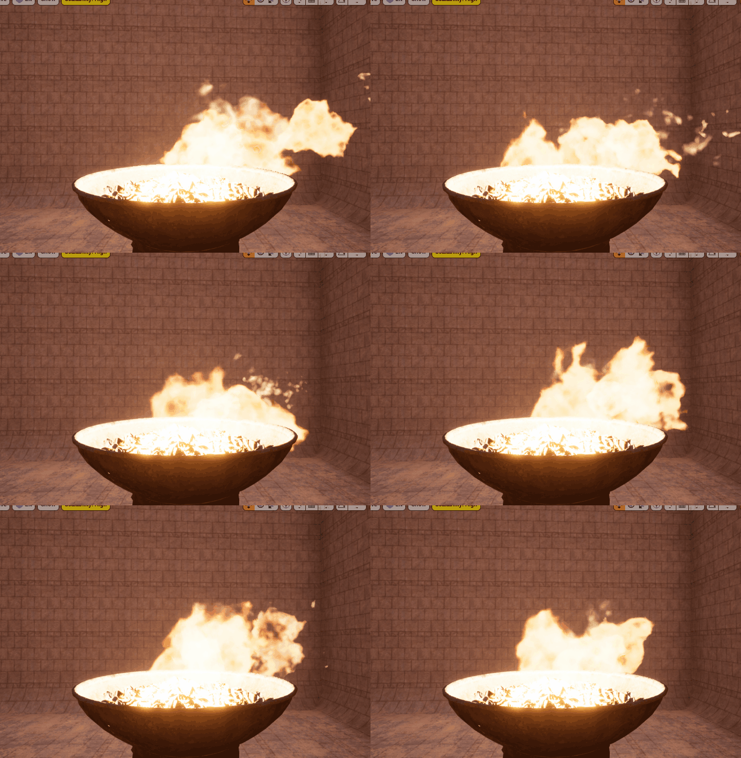
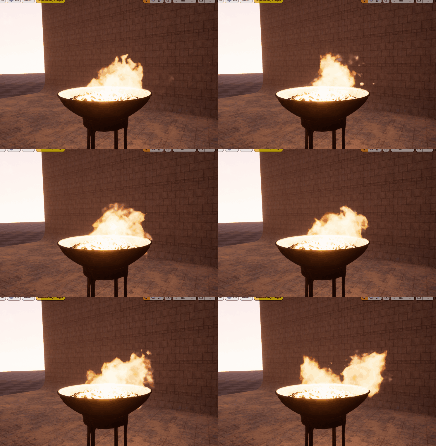
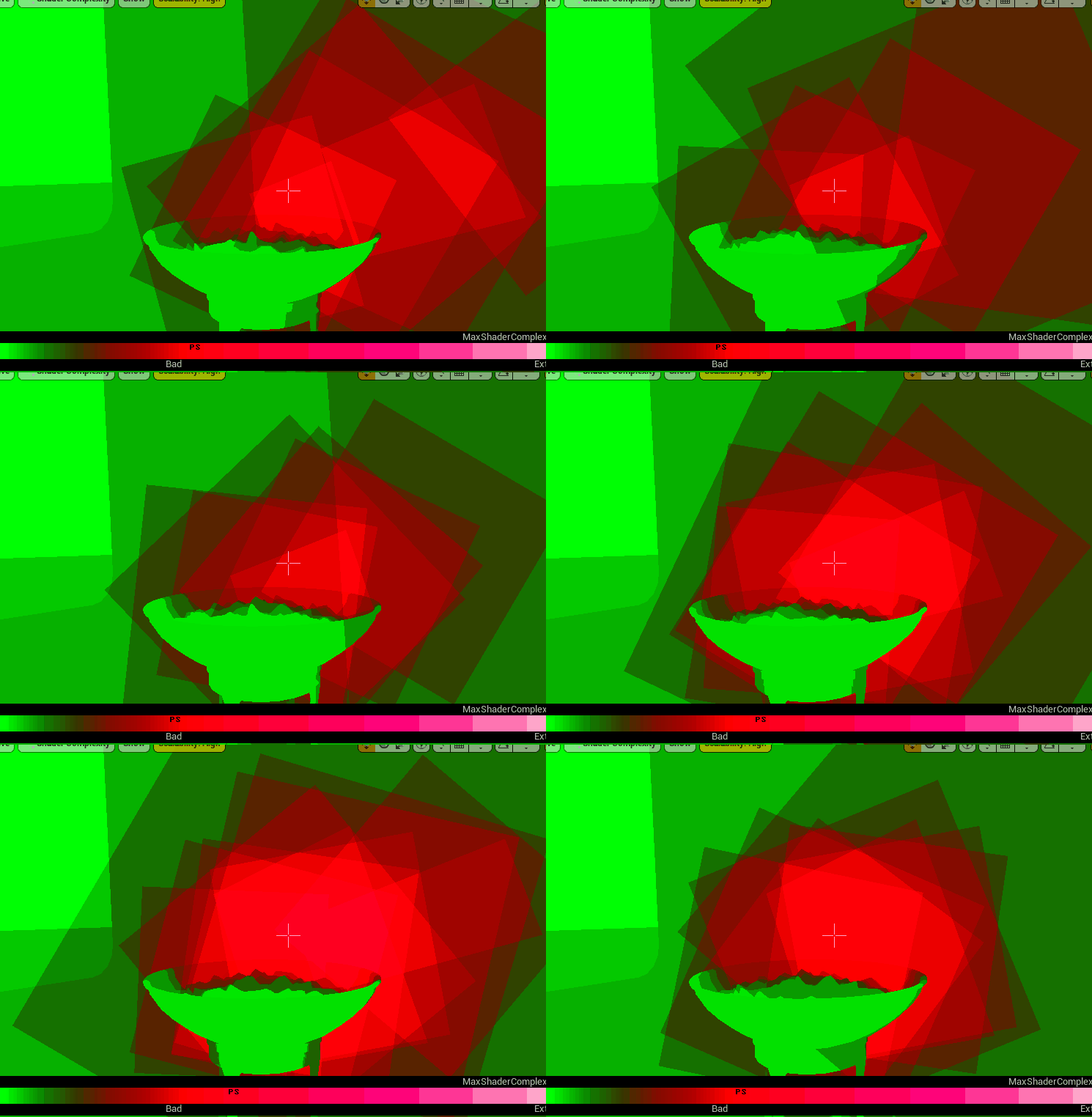
Now, this doesn’t fix the rendering complexity when rendering LOD 0. For this, we would have to really dig into material settings, or cut small instructions. Most likely we wouldn’t get that much out of lowering the material quality much further, and we might have better odds looking into the particle system parameters. I won’t go too in detail as to how to optimize these, and I made extreme cuts, but if we simply lower the spawn rate for all the fire systems, lets say 5.88 down to 3, the velocity down to 3, and the tips down to 4. Let’s see the difference here:
Simple
Complex
In my mind, I don’t particularly notice a difference of the two fires. And the number of quads is much lower as you can see, and thus we have less overlap. One test I love to give myself when presented things like this when one option looks a little worse but is better. “If I didn’t see these side-by-side, if the worse version was all I ever knew or saw, would I notice?” This is a question I ask myself a lot in games, as it’s critical, you need to get everything as bad as it can be without being noticeable (ideally). In this case, I don’t think I would notice.
The Wall:
The wall is a much more straightforward issue, there is no associated particle effect, there is no transparency, there is no overlapping, etc. It’s just a wall/floor. Looking at the material, we can see that it is rather complex, there are 146 instructions on the base shader pass. We see there are four textures being read, and they already did a great job packing the Roughness, Metalness, Ambient Occlusion, and Other into one texture (don’t know what other is). We have material functions being ran for sand, flatten normal, and a MatLayerBlend between the sand and height map we have. Lots going on!
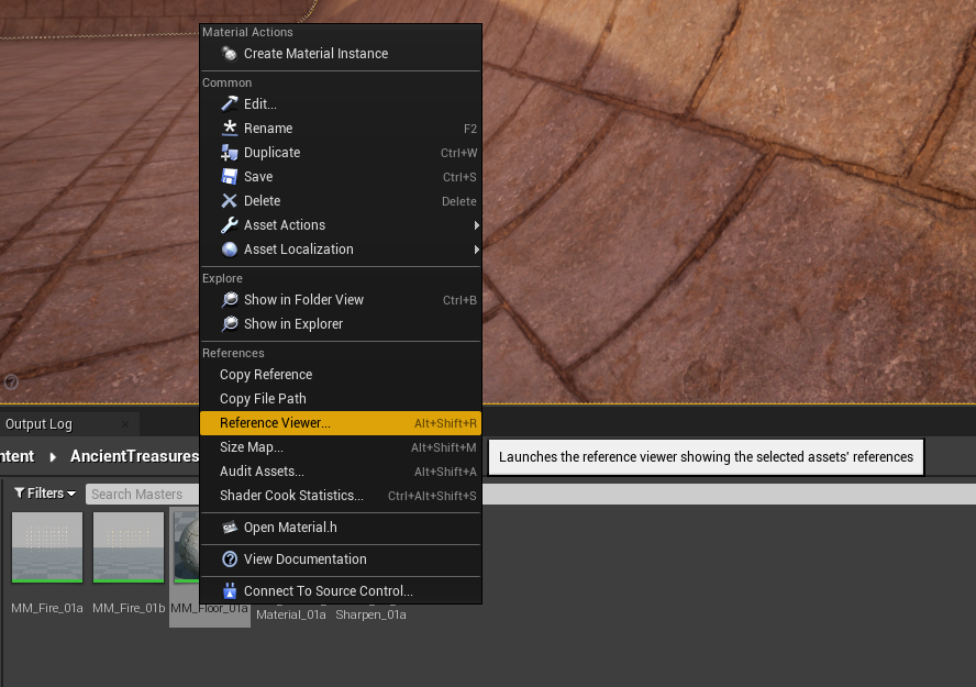
Now, lots of these features are great, and this is why you should never optimize at the beginning of development, you might want these features and they aren’t very expensive as far as shaders go, if we’re being real these shaders in this scene are not bad. But, once your done the game and you can strip out anything unused, this would be the time to do it! Looking at the “Reference Viewer”, we are only using the material in one material instance!
In the reference view, we can actually see that secretly, in that sand function, there are four other sand textures being referenced as well!
What this means though, is that anything we want in the material is designed for only this one floor option. So anything we don’t want can be cut, and anything overly complex, we can simplify.
One of the first things I notice, is that they packed their Roughness, Metalic, AO and Other texture together this is fantastic! This is what you want to be doing, as reading 4 different one-channel textures would be many more instructions than just one. However, I don’t know what this “Other” channel is for, we have no use for it in our game, and our one and only floor doesn’t use it. We also have a one-channel texture being read all on it’s own, this being the height map. Why not pack that into the alpha channel?
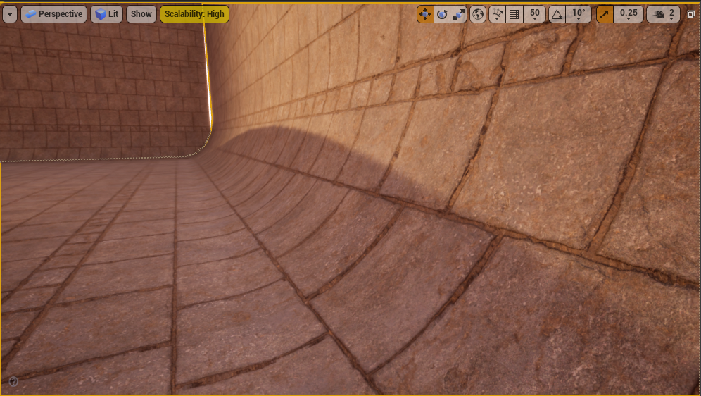
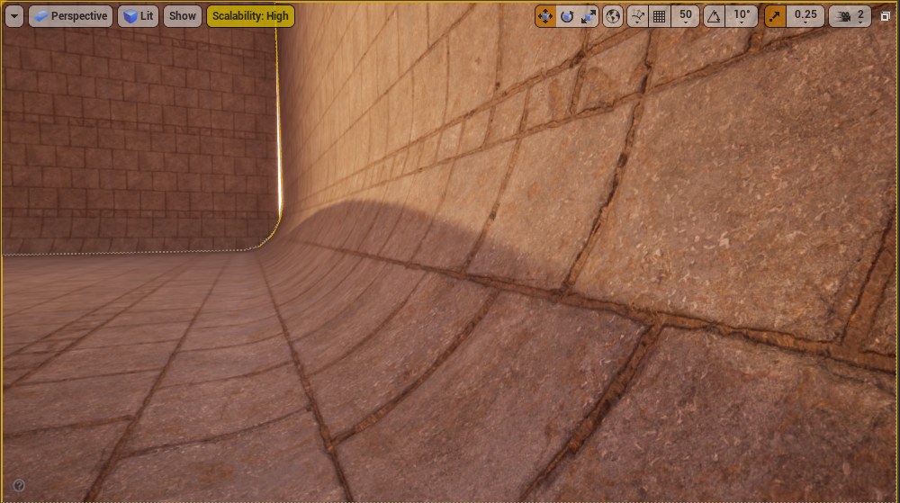
Alright, for real, there may be reasons not to pack this, the main reason being that the height map changes the model itself, a height map will shift points on the mesh in different directions, and thus, we can see why they have this separated, read it first, use a bump offset node to calculate new UVs, and then pump those through to the textures we want to sample at the proper UVs. However, this is a wall and floor, not exactly a hero asset, and the player will almost never be looking so close at the wall/floor that they notice these sublties. Let’s see how it looks if we connect these textures into the base UVs, not the heightmap UVs.
With heightmap UVs
Without heightmap UVs.
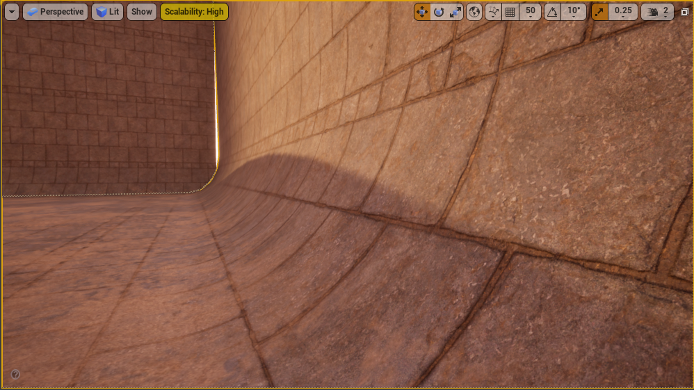
Aside from my camera work not lining up perfectly, they look indistinguishable to me. This saves us 9 instructions going from 146 to 137. However, we haven’t packed the height map into the other channel yet, we’re still doing an extra read, and texture reads are one of, if not the most expensive operation you can do. To get an idea of how this could run, let’s temporarily use the red channel from the normal map as our heighmap.
And here we go, I don’t even think we need to pack that height map, the normal map is doing just fine! This looks great and like I said above, if I wouldn’t notice unless looking side by side, then I’m sure it’s fine. Worth noting in this image I turned ON the sand feature, which was off in the shots above.
Now, you could continue this process of packing data into different channels, re-utilizing textures, making texture resolutions smaller and utilizing an atlas, etc. There are many ways that you can reduce texture samples and each one you cut is going to be a big savings. Make sure to look into the actual code for the sand functionality, as that is being called and could potentially have a big impact on performance as well!
LODS
LODS are short for “Levels of Detail”. Just as we added higher (less realistic) levels of detail to the fire particle effect, every mesh in your game can have multiple LODS. Most of the time, when people think of higher LODs, they think of a mesh with greatly reduced topology, and lower texture resolution. These are great! However, you also gain access to swapping out the material, you can duplicate a transparent window for instance, but on LOD3, swap that transparent window for one that’s opaque, this helps cut down on transparent rendering, which is much more expensive.
For now, know that you have these options in your toolkit, and if you want more information, please refer to my separate article on LODS in Unreal Engine. https://www.chrismccole.com/blog/lods-unreal-engine-4
Required Texture Resolution Viewmode
Along with the shader complexity viewmode we talked about earlier, there is also a viewmode for showing how much detail is loaded onto a model for a particular LOD in your screen right now, vs how much detail can even be displayed at such as distance.
It’s important to note that this will change per camera distance to the object, and thus, this will change the LOD as well. You can’t just pop this view on from one position and check everything in your scene, you will want to view objects at various distances that you imagine players seeing in-game. This tool will let you know whether you can scale down your texture resolution. Likewise, if you have a closeup shot of a character for instance, it may tell you that you want to scale your texture up to get the full effect of the shot. It’s up to you but textures are what take up the most space on a game (typically). So scaling these down so that your not wasting resources can be critical!
Conclusion
There are still many specific areas you could delve into with this topic, this really only scratches the surface of how to begin optimizing materials for your game. I hope that this was helpful!
